LAB SESSION 5
CORRELATION
AND REGRESSION
INTRODUCTION: Not only is it important to analyze single variables, but
frequently one needs to determine if and how two variables are related. The correlation coefficient is a measure of
the strength of the linear relationship between two variables. In these exercises you will use Excel to
analyze this statistic, and these exercises will also give you a very brief
introduction to linear regression.
INVESTIGATIONS OF THE
CORRELATION COEFFICIENT
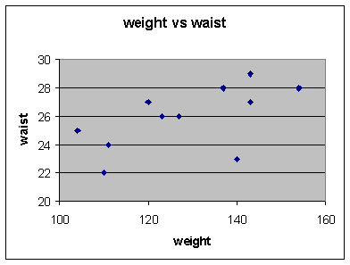
The data set below is a sample of weight and waist
size for 11 women. You will use that data to estimate the
correlation between a woman's weight and her waist size. Once that value
has been determined you will show that this value is independent of the scale of the two
variables.
Weights
and Waist Sizes
weight(lbs):
110 143 120 127 143
111 137 154
123 104 140
waist
(ins): 22 29 27 26
27 24 28 28 26
25 23
Enter the data into the worksheet and name the two
variables.
Get a scatter diagram of the bivariate data
set. The variable 'WEIGHT' should be
on the x-axis and 'WAIST' on the y-axis.
Choose: Chart Wizard > XY(Scatter) > 1st
picture > Next
Enter: Data Range: select cells > Next
We can edit the scatter
plot (since all the points are in a corner), and rescale the axes to reflect
the data range.
Right click on the X-axis
Select: Format Axes
Click on the Scale
tab: Change the minimum and maximum
values for X.
Minimum: 100
Maximum: 160
Major unit: 20
Minor unit:
5
Also make appropriate
changes to the y-axis scale
Let’s also generate descriptive statistics for each of these
variables:
Choose: Tools > Data Analysis >
Descriptive Statistics > OK
Enter: Input Range: select cells
Output Range:
select cell
Choose: Summary statistics > OK
* the output shown
below is edited for clarity
|
Weight
|
|
waist (ins)
|
|
|
|
|
|
|
|
Mean
|
128.3636
|
|
Mean
|
25.90909
|
|
Median
|
127
|
|
Median
|
26
|
|
Mode
|
143
|
|
Mode
|
27
|
|
Standard Deviation
|
16.21279
|
|
Standard Deviation
|
2.21154
|
|
Range
|
50
|
|
Range
|
7
|
|
Minimum
|
104
|
|
Minimum
|
22
|
|
Maximum
|
154
|
|
Maximum
|
29
|
|
Count
|
11
|
|
Count
|
11
|
Calculate
the correlation coefficient, r.
Choose: Insert function, fx >
Statistical > Correl > OK
Enter:
Array 1: x data range
Array 2: y data range
> OK
*
QUESTIONS:
1. Would you say that the variables were positively or
negatively correlated? Is there a
strong or weak correlation?
2. If you were to add an equal amount of weight to each woman
(assume no change in waist size), would the value of r, the correlation
coefficient, change? Test your
conjecture by adding 25 lbs. to each woman's weight and recalculate r. The necessary commands are:
Activate cell C2 and type “= A2 + 25”, then drag
right corner down to perform the same calculation on all of column A. Redo the correlation using column C for
Array 1.
3. If you were to change the scale of the variables: weight to
kg and waist size to meters, would the value of r change? Test your conjecture by multiplying 'WEIGHT'
by 0.453 and 'WAIST' by .0254 and
recalculate r. How will the scatter
diagram change when you change the scales?
4. The last observation in your data set was for a model known
for her especially thin figure. If you
eliminated it from the data set, how much would r change? Would you say that the statistic, r, is
sensitive to extreme observations?
Explain.
INTERPRETATION OF THE
CORRELATION COEFFICIENT
In this next section, we will be examining some scatter
diagrams of computer-generated data to gain a more thorough understanding of
just what the value of the correlation coefficient means. For each pair of
variables, you will calculate r and look at the corresponding scatter diagram.
Enter the values from 0 to 50 for your first
variable and name your variable “x”.
Enter 0 in A1, enter 1 in A2, then right click on
lower right corner and drag to
A52
Choose: Fill
series
In cell B1 enter the name Random, then
activate cell B2, and continue with:
Enter: =rand(
)
Click and drag:
lower right corner of B2 cell to row 52
Get a scatter diagram of the two variables and
calculate r.
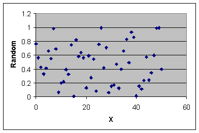
When comparing your output to that presented here,
remember you are working with
random data and there will be variation in results.
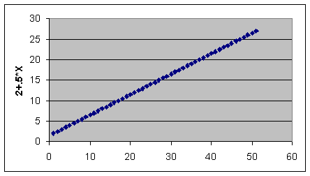
Next, generate a set of y values which has no random
component:
Activate cell C2, type =2+A2*.5, click and drag
lower right corner of cell
down through row 52.
Generate a set of y values that have a small random
component and repeat above procedure.
fill
column D with = 2 + 0.5 * A2 + B2
Generate a set of y values that are negatively
correlated, and repeat above procedure.
fill
column E with = 2 - 0.5 * A2 + B2
Generate a set of y values that have a large random
component and repeat previous procedure.
fill column F with = 5 + 0.5 * A2 + 2 * B2
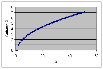
Generate a set of y values that are non-linearly
related to x.
fill
column G with = SQRT(0.1*A2)
Generate a second set of y values which are related
but not linearly related to x
and repeat previous procedure.
fill
column H with = 9 - (A2 - 25)**2

QUESTIONS:
1. Using the results from above, what type of relationship can you
determine between the correlation coefficient and the scatterplot? What type of pattern do you see in the scatter diagram when r is
close to zero? When r is close to
one? What is the pattern like when r is
negative?
2. Does r being close to zero imply that the two variables are
unrelated? Check column H versus column
A before answering this question.
LINEAR REGRESSION
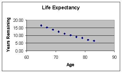
Example: Consider the two variables: a person’s
current age and the expected number of remaining years of living independently.
|
Age, x
|
65
|
67
|
69
|
71
|
73
|
75
|
77
|
79
|
81
|
82
|
|
Years remaining, y
|
16.5
|
15.1
|
13.7
|
12.4
|
11.2
|
10.1
|
9.0
|
8.4
|
7.1
|
6.4
|
Get a feeling for whether years remaining and the
person’s age are correlated by doing a scatter plot and calculating
correlation.
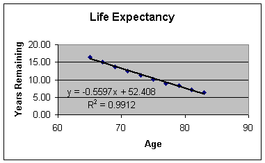
The
least squares line can be added to the plot, along with its equation and the
value of r2. Right click on
one of the data points shown in the scatter plot. A drop-down menu will appear.
Select: Add
Trendline
Select: Type : Linear
Select: Options,
then check Display equation of chart and Display R-squared on chart > OK.
What is the expected years
remaining for a person who is 70 years old?
To answer this question we’ll use the Forecast command from the insert
function.
Choose: Insert function, fx
Select: Or
select a category : Statistical
Select: FORECAST > OK
Fill in the dialog box as
shown:
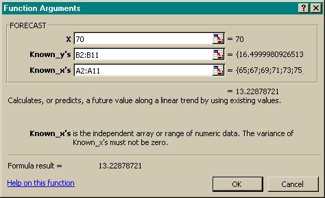
The worksheet shows the
results.
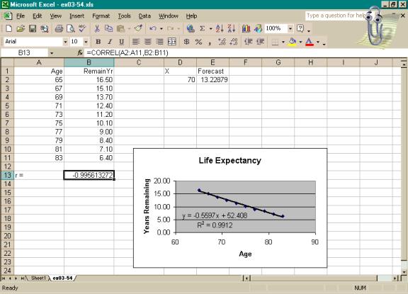
If we want to obtain the
values of slope and intercept without using the Chart Wizard, we can use
LINEST(y range, x range). Activate two
horizontally adjacent cells on the worksheet.
Type =LINEST(B2:B11, A2:A11)
in the formula bar and press Ctrl+Shift+Enter
to generate the values of both slope and intercept.
*
|
slope
|
intercept
|
|
-0.559696919
|
52.40757151
|
Here we will illustrate the
default output generated by the Regression
command for Exercise 3.61. Notice
that a great deal of information is generated, but at this point we would need
only the coefficients highlighted in red.
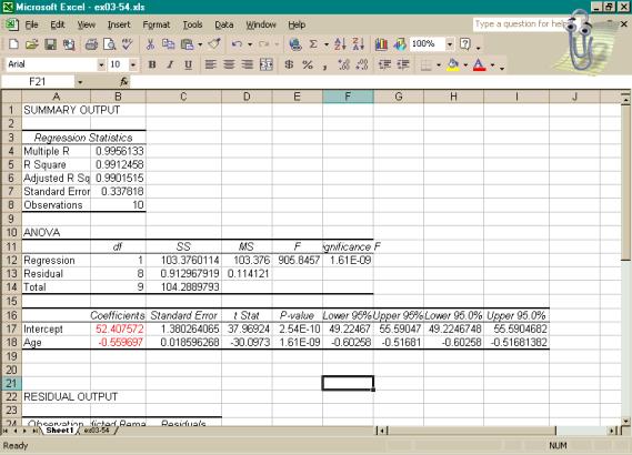
Scrolling down would show the rest of the residual
output.

ASSIGNMENT: Do Exercises 3.22, 3.41, 3.42, 3.61, and 3.86 in your text.