LAB SESSION 15

 ANALYSIS OF VARIANCE


INTRODUCTION:  In earlier sessions you have examined and compared means from

two samples.  We will now practice a technique that tests hypothesis about several

means.  While we could compare the means in pairs as we have done before, the process could become too unwieldy to be of any use.  Analysis of variance (ANOVA) allows us

to test all the means at the same time to see if there is any significant difference between them.


The Logic Underlying The Anova Technique

 We will be forming a comparison between two estimates of the population variance: one based on the variance within each set of data and the other between the sets of data.   We

 will use the F distribution for this comparison.  If there is relatively little difference

within each group and a large difference between the sample means, we will reject the

null hypothesis.  (Remember we always word the null hypothesis to say “there is no difference...”).  If there is a lot of variance within a group and little between groups, we cannot conclude that the population means are different.  We also need to know that the groups under investigation are approximately normally distributed and independent. 

ANOVA is presented as a table, and we need to define our terms in order to understand

what the table is telling us.  The Factor is the variable whose means we are interested in studying.  When we first set up our data charts in Excel, each column will represent different Levels of the Factor we are examining.  Each row will be a data value from

repeated samplings, called a Replicate.  The ANOVA table will give a summary of the data with the different levels of the Factor in the first column, followed by each levels’ count, sum average and variance in subsequent columns across the rows.  It then gives you a chart  describing the sources of variation both Between Groups and Within Groups


PERFORMING AN ANOVA ANALYSIS

This sample problem will take you through the steps of entering the data and generating

the ANOVA table for Illustration 12-1 in your textbook. The FACTOR we are looking at

is temperature and whether it has any effect on production.  We will examine production

at three different temperature levels: 68°, 72°, 76°.  These levels form our columns.  The production amounts are the replicates and form the rows of the data table.  You can name

the columns and enter the data directly into the worksheet.


If we did a Box Plot of the three columns some interesting things are shown.


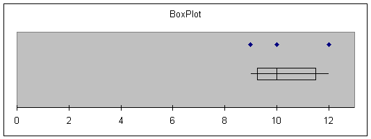
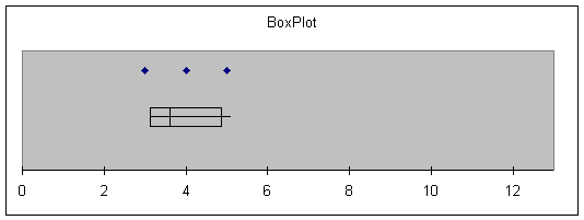
Note that the points within each level are fairly close, but the three levels hardly overlap at all.

The commands for generating the ANOVA table is as follows:


Choose:            Tools > Data Analysis > ANOVA: Single Factor > OK

Enter:               Input Range: A3:C8

Select:              Output Range:

Enter:               A10                             (or the upper left corner where you want it)


The worksheet will look like this:


Illustration 12.1


Sample from 68o

Sample from 72o

Sample from 76o


10

7

3


12

6

3


10

7

5


9

8

4


7


Anova: Single Factor


SUMMARY


Groups

Count

Sum

Average

Variance


Sample from 68o

4

41

10.25

1.583333


Sample from 72o

5

35

7

0.5


Sample from 76o

4

15

3.75

0.916667


ANOVA


Source of Variation

SS

df

MS

F

P-value

F crit

Between Groups

84.5

2

42.25

44.47368

1.05E-05

4.102816

Within Groups

9.5

10

0.95


Total

94

12


Compare the output to the calculations in Illustration 12-1 in the text.

Note in particular that the calculated value for F*  =  44.47.  To make our decision, we

need to compare this to the critical value  F(2,10,.05) = 4.10.  We can therefore conclude

that at least one of the temperatures has an effect on the production level. The p-value

given in the chart can also be used to determine the conclusion.  How would you

interpret it?


Exercise 12.32 in the chapter compares the stopping distances for four brands of tires.

Using the data given there, is there sufficient evidence to conclude that there is a

difference in the mean stopping distances at the  a = .05 level?

This data may be found on the Student Suite CD as ex12-28

a) State your null and alternative hypotheses.

b) Find your critical region and value for F.

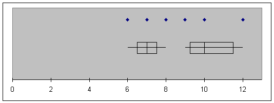
c) 1) Enter your data in columns 1 - 4, naming them A, B, C, D respectively.

    2) Do a box plot to get a feel for how the data interact.

    3) Perform an ANOVA to calculate F*.  What does the p value tell you?

Explain.

d) Draw your conclusion about the null hypothesis and explain what it means to                  you.  How would your conclusion change if a changed?


ASSIGNMENT:  Do Exercises 12.17, 12.18, and 12.22 in your text. The data for

Exercises 12.17, 12.18 and 11.22 may be found on the Student Suite CD.